- Closed - The Main Page headers and buttons are now updated
I'm new to Wikia so forgive me for any mistakes I may make, but I have been using the SNN for quite a while now and wanted to make a contribution to the sites graphics, namely the main page. Below are a set of buttons/icons I made. After showing them to Myself 123, he suggested that I post them on a forum, to show everyone else. I would like to hear your opinions/critique.

Objects

Locations

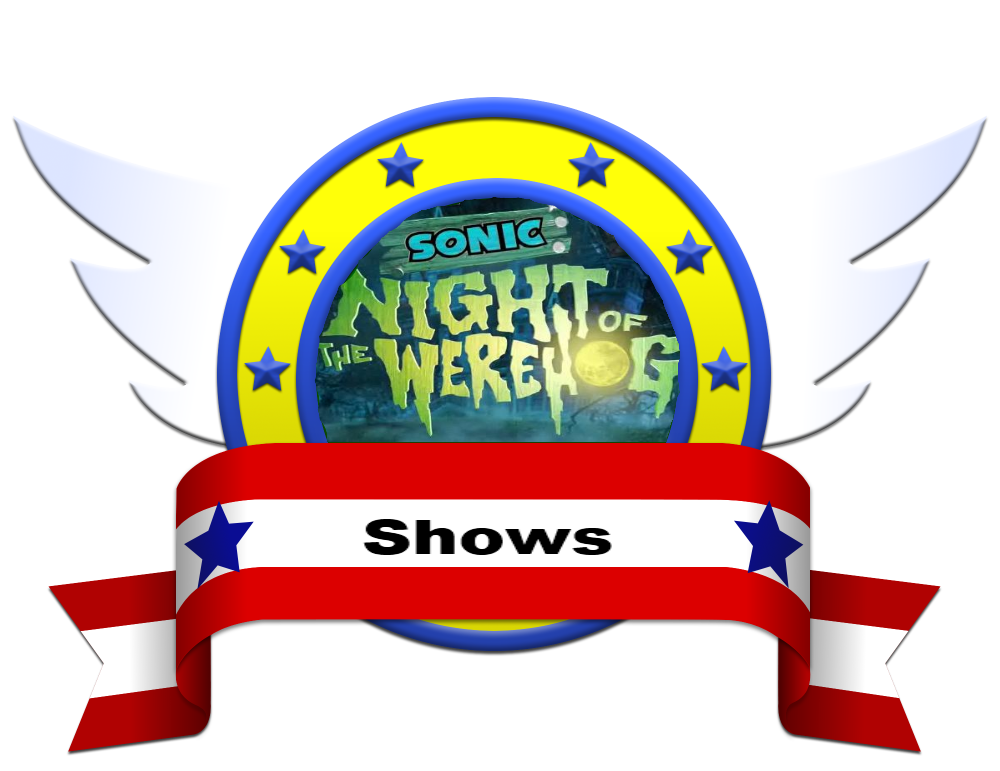
Shows

Comics

Games

Real-World

Super Forms

Villains

Anti-Heroes

Heroes
Well, on here, 58SlugDrones has pretty good Tiles for the Main Page as well, maybe better, IMO. --Bullet FranciscoContribs Blog 20:19, October 19, 2011 (UTC)
Johnsowhat94 21:18, October 19, 2011 (UTC) Ok, well thank you for your time and I'm glad that someone is already working on it. I forgot to mention I was working on things as well if you interested.
Well, if you could finish what that user started... --Bullet Francisco (talk) Contributions Editcount 21:21, October 19, 2011 (UTC)
Johnsowhat94 21:41, October 19, 2011 (UTC)
I had finished this a few day ago. If you want it.
Wow! That's really great! Do the rest of them, and then the community will decide. Nice Work! --Bullet Francisco (talk) Contributions Editcount 21:43, October 19, 2011 (UTC)
Johnsowhat94 21:53, October 19, 2011 (UTC) Ok! Give me an hour or so and let me see what else I can do.

Yeah, better than my orgionals, then again, I only had Paint. Myself 123 22:06, October 19, 2011 (UTC)
The Main Page needs something new anyway. I still liked 58's version of the Tiles, though. --Bullet Francisco (talk) Contributions Editcount 22:08, October 19, 2011 (UTC)
Johnsowhat94 22:21, October 19, 2011 (UTC) Well my main inspiration for the tiles was Sonic Generation's character loading screen (black bg and white silhouette). I may be able to replicate 58's work if you'd like. I also still use paint for a lot of the sprite work.
Here is another.

Nice Work! If you don't mind, and if it's not to much trouble, can you replicate 58's work? --Bullet Francisco (talk) Contributions Editcount 22:21, October 19, 2011 (UTC)
Johnsowhat94 22:26, October 19, 2011 (UTC) If I could find the original file he used for the border, then I may be able to. Could take some time to piece together though. It looks like it may have came from the Sonic4 website.
I can contact 58 for you if you want. She may not answer until 12 hours from now, though. --Bullet Francisco (talk) Contributions Editcount 22:29, October 19, 2011 (UTC)
Johnsowhat94 22:33, October 19, 2011 (UTC) Ok, I checked and it looks like he got it from the The Spriter's Resource[1] Which is good because that means less work for me. XD
Lol, if its too much work, then you don't have to do it. Sonic News Network really appreciates all your doing for us. --Bullet Francisco (talk) Contributions Editcount 22:34, October 19, 2011 (UTC)
Johnsowhat94 22:36, October 19, 2011 (UTC) I don't mind, I don't get to do things like this too often.

Alrighty then, thanks for your help. --Bullet Francisco (talk) Contributions Editcount 22:38, October 19, 2011 (UTC)
I have two this time. Working on the last one. Johnsowhat94 22:45, October 19, 2011 (UTC)
There, thats all the headers. The Tiles are going to have to wait until either tonight or tomorrow as I have to leave in about an hour. Johnsowhat94 22:51, October 19, 2011 (UTC)
Alright. Thank you so much!
Also, don't copy 58's work for now. --Bullet Francisco (talk) Contributions Editcount 00:10, October 20, 2011 (UTC)
|
| ||||||||||||||||||||||||||||||||||||||||||||||||||||||||||||||||||||||||||||||||||||||||||||||||||||||||||||||||||||||||||||||||||||||||||||||||||||||||||||||||||||||||||||||||||||||||||||||||||||||||||||||||||||||||||||||||||||||||||||||||||||||||||||||||||||||||||||||||||||||||||||||||||||||||||||||||
The headers are good, though I would've preferred it if the palettes weren't altered. Myself 123 17:05, October 20, 2011 (UTC)
- Those headers are fantastic. Let's definitely use those! -- Supermorff 17:14, October 20, 2011 (UTC)
|
|
| ||||||||||||||||||||||||||||||||||||||||||||||||||||||||||||||||||||||||||||||||||||||||||||||||||||||||||||||||||||||||||||||||||||||||||||||||||||||||||||||||||||||||||||||||||||||||||||||||||||||||||||||||||||||||||||||||||||||||||||||||||||||||||||||||||||||||||||||||||||||||||||||||||||||||||||||||


Nice Work! I could update the Main Page if you guys want. --Bullet Francisco (talk) Contributions Editcount 19:41, October 20, 2011 (UTC)
|
|
| ||||||||||||||||||||||||||||||||||||||||||||||||||||||||||||||||||||||||||||||||||||||||||||||||||||||||||||||||||||||||||||||||||||||||||||||||||||||||||||||||||||||||||||||||||||||||||||||||||||||||||||||||||||||||||||||||||||||||||||||||||||||||||||||||||||||||||||||||||||||||||||||||||||||||||||||||
I planned on using them, i just don't know if I should update now, or wait. --Bullet Francisco (talk) Contributions Editcount 19:58, October 20, 2011 (UTC)
|
|
| ||||||||||||||||||||||||||||||||||||||||||||||||||||||||||||||||||||||||||||||||||||||||||||||||||||||||||||||||||||||||||||||||||||||||||||||||||||||||||||||||||||||||||||||||||||||||||||||||||||||||||||||||||||||||||||||||||||||||||||||||||||||||||||||||||||||||||||||||||||||||||||||||||||||||||||||||
I love those buttons too. New headers and new buttons, it's great! Gen, can you please post the alternate Shows button so that we can compare and decide which one we like more? -- Supermorff 20:46, October 20, 2011 (UTC)
|
|
| ||||||||||||||||||||||||||||||||||||||||||||||||||||||||||||||||||||||||||||||||||||||||||||||||||||||||||||||||||||||||||||||||||||||||||||||||||||||||||||||||||||||||||||||||||||||||||||||||||||||||||||||||||||||||||||||||||||||||||||||||||||||||||||||||||||||||||||||||||||||||||||||||||||||||||||||||
I love your work, but can I make a suggestion? I think you should use an image of Green Hill instead of City Escape for the Stage icon.
|
|
| ||||||||||||||||||||||||||||||||||||||||||||||||||||||||||||||||||||||||||||||||||||||||||||||||||||||||||||||||||||||||||||||||||||||||||||||||||||||||||||||||||||||||||||||||||||||||||||||||||||||||||||||||||||||||||||||||||||||||||||||||||||||||||||||||||||||||||||||||||||||||||||||||||||||||||||||||
I have a suggestion Gen, for the Games, use the boxart of Sonic Generations instead of Classic and Modern Sonic. --Bullet Francisco (talk) Contributions Editcount 21:14, October 20, 2011 (UTC)
|
|
| ||||||||||||||||||||||||||||||||||||||||||||||||||||||||||||||||||||||||||||||||||||||||||||||||||||||||||||||||||||||||||||||||||||||||||||||||||||||||||||||||||||||||||||||||||||||||||||||||||||||||||||||||||||||||||||||||||||||||||||||||||||||||||||||||||||||||||||||||||||||||||||||||||||||||||||||||
I think we should use Gen's/ 58's buttons and use John's headers. Jake the Hedgehog The Ultimate Apprentice 21:09, October 20, 2011 (UTC)

|
| ||||||||||||||||||||||||||||||||||||||||||||||||||||||||||||||||||||||||||||||||||||||||||||||||||||||||||||||||||||||||||||||||||||||||||||||||||||||||||||||||||||||||||||||||||||||||||||||||||||||||||||||||||||||||||||||||||||||||||||||||||||||||||||||||||||||||||||||||||||||||||||||||||||||||||||||||
We arent using them. --Bullet Francisco (talk) Contributions Editcount 21:27, October 20, 2011 (UTC)
|
|
| ||||||||||||||||||||||||||||||||||||||||||||||||||||||||||||||||||||||||||||||||||||||||||||||||||||||||||||||||||||||||||||||||||||||||||||||||||||||||||||||||||||||||||||||||||||||||||||||||||||||||||||||||||||||||||||||||||||||||||||||||||||||||||||||||||||||||||||||||||||||||||||||||||||||||||||||||
Yea.Jake the Hedgehog The Ultimate Apprentice 21:30, October 20, 2011 (UTC)
|
|
| ||||||||||||||||||||||||||||||||||||||||||||||||||||||||||||||||||||||||||||||||||||||||||||||||||||||||||||||||||||||||||||||||||||||||||||||||||||||||||||||||||||||||||||||||||||||||||||||||||||||||||||||||||||||||||||||||||||||||||||||||||||||||||||||||||||||||||||||||||||||||||||||||||||||||||||||||
I like the idea. I was thinking about changing them, too.
Knowall - October 20, 2011 19:46
i agree. even when i joined the main page is still the same. its desperate for a revamp. --Felectrify (talk) 21:55, October 20, 2011 (UTC)
I personally wanna wait for 58: she has her own plans for changes in appearance that she was working on for much longer. Circumstance forced her to temporarily drop her project. Since she did the original revamp in the first place, I think it only fair we wait to see what she has first.--Kagimizu-Seeya 'round 07:24, October 23, 2011 (UTC)
- 58 commissioned these buttons. She put them on her 'changes' page. The only reason we haven't changed them already is because she was gone before the last few buttons were finished. I say we just change them and give her a nice surprise when she gets back. -- Supermorff 09:47, October 23, 2011 (UTC)
I know the buttons are hers. But if I remember correctly, she had much more than just changing the buttons in mind.--Kagimizu-Seeya 'round 09:50, October 23, 2011 (UTC)
- And she will be upset if we make one of her changes and not all of them at once? -- Supermorff 14:21, October 23, 2011 (UTC)
|
|
| ||||||||||||||||||||||||||||||||||||||||||||||||||||||||||||||||||||||||||||||||||||||||||||||||||||||||||||||||||||||||||||||||||||||||||||||||||||||||||||||||||||||||||||||||||||||||||||||||||||||||||||||||||||||||||||||||||||||||||||||||||||||||||||||||||||||||||||||||||||||||||||||||||||||||||||||||
 Comment: She closed her dA account just days ago, that isn't a good sign for her return, I am all in favor of changing the graphics ASAP. --Bullet Francisco (talk) Contributions Editcount 00:21, October 24, 2011 (UTC)
|
|
| ||||||||||||||||||||||||||||||||||||||||||||||||||||||||||||||||||||||||||||||||||||||||||||||||||||||||||||||||||||||||||||||||||||||||||||||||||||||||||||||||||||||||||||||||||||||||||||||||||||||||||||||||||||||||||||||||||||||||||||||||||||||||||||||||||||||||||||||||||||||||||||||||||||||||||||||||
Oh guys these are amazing!--58SlugDrones • (Contact) 09:03, October 26, 2011 (UTC)
|
|
| ||||||||||||||||||||||||||||||||||||||||||||||||||||||||||||||||||||||||||||||||||||||||||||||||||||||||||||||||||||||||||||||||||||||||||||||||||||||||||||||||||||||||||||||||||||||||||||||||||||||||||||||||||||||||||||||||||||||||||||||||||||||||||||||||||||||||||||||||||||||||||||||||||||||||||||||||
Let's put them up already. What are we waiting for?--58SlugDrones • (Contact) 05:24, October 27, 2011 (UTC)
I addded to what is agreed upon, on the Main Page. I must say, it looks pretty stylish and awesome! Thanks to those who contributed! Oh wait... did I add them too early?--58SlugDrones • (Contact) 08:39, October 27, 2011 (UTC)
Post-implementation[]
|
|
| ||||||||||||||||||||||||||||||||||||||||||||||||||||||||||||||||||||||||||||||||||||||||||||||||||||||||||||||||||||||||||||||||||||||||||||||||||||||||||||||||||||||||||||||||||||||||||||||||||||||||||||||||||||||||||||||||||||||||||||||||||||||||||||||||||||||||||||||||||||||||||||||||||||||||||||||||
I'll do that. --Bullet Francisco (talk) Contributions Editcount 19:45, October 27, 2011 (UTC)
- I've just made the buttons even bigger. I think it was necessary, although it meant I had to rearrange them and now 'Real world' is down at the bottom all by himself. Even at this larger size, the text in the 'Super transformations' button is a bit small. If we got rid of that button, it would be a nice 3 by 3 square. Thoughts? -- Supermorff 19:58, October 27, 2011 (UTC)
|
|
| ||||||||||||||||||||||||||||||||||||||||||||||||||||||||||||||||||||||||||||||||||||||||||||||||||||||||||||||||||||||||||||||||||||||||||||||||||||||||||||||||||||||||||||||||||||||||||||||||||||||||||||||||||||||||||||||||||||||||||||||||||||||||||||||||||||||||||||||||||||||||||||||||||||||||||||||||
But I like the idea of a 3 x 3 square better, we should just get rid of one of the buttons. --Bullet Francisco (talk) Contributions Editcount 20:04, October 27, 2011 (UTC)
|
|
| ||||||||||||||||||||||||||||||||||||||||||||||||||||||||||||||||||||||||||||||||||||||||||||||||||||||||||||||||||||||||||||||||||||||||||||||||||||||||||||||||||||||||||||||||||||||||||||||||||||||||||||||||||||||||||||||||||||||||||||||||||||||||||||||||||||||||||||||||||||||||||||||||||||||||||||||||
It's better, but we've still got 'Real world' down the bottom by himself. -- Supermorff 20:13, October 27, 2011 (UTC)
|
|
| ||||||||||||||||||||||||||||||||||||||||||||||||||||||||||||||||||||||||||||||||||||||||||||||||||||||||||||||||||||||||||||||||||||||||||||||||||||||||||||||||||||||||||||||||||||||||||||||||||||||||||||||||||||||||||||||||||||||||||||||||||||||||||||||||||||||||||||||||||||||||||||||||||||||||||||||||
All of the buttons needed to be bigger, not just that one. -- Supermorff 20:51, October 27, 2011 (UTC)
|
|
| ||||||||||||||||||||||||||||||||||||||||||||||||||||||||||||||||||||||||||||||||||||||||||||||||||||||||||||||||||||||||||||||||||||||||||||||||||||||||||||||||||||||||||||||||||||||||||||||||||||||||||||||||||||||||||||||||||||||||||||||||||||||||||||||||||||||||||||||||||||||||||||||||||||||||||||||||
Aside from asking them "bigger", I have an idea to even it out - make a button for the Males and Females categories - problem solved, we now have a perfect rectangle. If thats not too much work for Gen... --Bullet Francisco (talk) Contributions Editcount 21:05, October 27, 2011 (UTC)
|
|
| ||||||||||||||||||||||||||||||||||||||||||||||||||||||||||||||||||||||||||||||||||||||||||||||||||||||||||||||||||||||||||||||||||||||||||||||||||||||||||||||||||||||||||||||||||||||||||||||||||||||||||||||||||||||||||||||||||||||||||||||||||||||||||||||||||||||||||||||||||||||||||||||||||||||||||||||||
Changing the text on that button to say 'Super forms' is probably a good idea. Can I quickly nix the idea of 'Males' and 'Females' buttons? I'd rather have a button that links to the 'Browse' category (with a label Browse or Navigation or whatever) and maybe another to 'Groups and Species'. -- Supermorff 21:25, October 27, 2011 (UTC)
|
|
| ||||||||||||||||||||||||||||||||||||||||||||||||||||||||||||||||||||||||||||||||||||||||||||||||||||||||||||||||||||||||||||||||||||||||||||||||||||||||||||||||||||||||||||||||||||||||||||||||||||||||||||||||||||||||||||||||||||||||||||||||||||||||||||||||||||||||||||||||||||||||||||||||||||||||||||||||
I think maybe Morff's ideas for the categories is better than mine. --Bullet Francisco (talk) Contributions Editcount 21:28, October 27, 2011 (UTC)
- You could still use Chaotix for 'Groups and Species' (for which the label would probably be just 'Groups'). -- Supermorff 21:30, October 27, 2011 (UTC)
Yeah. --Bullet Francisco (talk) Contributions Editcount 21:31, October 27, 2011 (UTC)
About Super Transformations, shouldn't it just be Transformations? 'Cus I've been thinking, not all transformations are super transforamtions. Aren't the super transformations transformations that have "Super" as a prefex? Myself 123 21:35, October 27, 2011 (UTC)
|
|
| ||||||||||||||||||||||||||||||||||||||||||||||||||||||||||||||||||||||||||||||||||||||||||||||||||||||||||||||||||||||||||||||||||||||||||||||||||||||||||||||||||||||||||||||||||||||||||||||||||||||||||||||||||||||||||||||||||||||||||||||||||||||||||||||||||||||||||||||||||||||||||||||||||||||||||||||||
I don't really think Real-world being down on the alone on the bottom is all that important. One solution that is very inconvenient that I can think of is to just put the "comics" and "shows" into one "media" category to save space. As I said its probably more trouble than its worth. Forgive my ignorance Genesjs but what browse button are you talking about?
Johnsowhat94 16:06, October 28, 2011 (UTC)
|
|
| ||||||||||||||||||||||||||||||||||||||||||||||||||||||||||||||||||||||||||||||||||||||||||||||||||||||||||||||||||||||||||||||||||||||||||||||||||||||||||||||||||||||||||||||||||||||||||||||||||||||||||||||||||||||||||||||||||||||||||||||||||||||||||||||||||||||||||||||||||||||||||||||||||||||||||||||||
Did you find one for Groups? For Browse maybe you could just use the logo of the site, or Tails' gadget from SC or a computer. --Bullet Francisco (talk) Contributions Editcount 23:24, October 28, 2011 (UTC)
|
|
| ||||||||||||||||||||||||||||||||||||||||||||||||||||||||||||||||||||||||||||||||||||||||||||||||||||||||||||||||||||||||||||||||||||||||||||||||||||||||||||||||||||||||||||||||||||||||||||||||||||||||||||||||||||||||||||||||||||||||||||||||||||||||||||||||||||||||||||||||||||||||||||||||||||||||||||||||
Miles Electric --Bullet Francisco (talk) Contributions Editcount 23:46, October 28, 2011 (UTC)
|
|
| ||||||||||||||||||||||||||||||||||||||||||||||||||||||||||||||||||||||||||||||||||||||||||||||||||||||||||||||||||||||||||||||||||||||||||||||||||||||||||||||||||||||||||||||||||||||||||||||||||||||||||||||||||||||||||||||||||||||||||||||||||||||||||||||||||||||||||||||||||||||||||||||||||||||||||||||||

It's great! I'll add it to the Main page. --Bullet Francisco (talk) Contributions Editcount 01:09, October 29, 2011 (UTC)
|
|
| ||||||||||||||||||||||||||||||||||||||||||||||||||||||||||||||||||||||||||||||||||||||||||||||||||||||||||||||||||||||||||||||||||||||||||||||||||||||||||||||||||||||||||||||||||||||||||||||||||||||||||||||||||||||||||||||||||||||||||||||||||||||||||||||||||||||||||||||||||||||||||||||||||||||||||||||||
Yeah. --Bullet Francisco (talk) Contributions Editcount 01:40, October 29, 2011 (UTC)
|
|
| ||||||||||||||||||||||||||||||||||||||||||||||||||||||||||||||||||||||||||||||||||||||||||||||||||||||||||||||||||||||||||||||||||||||||||||||||||||||||||||||||||||||||||||||||||||||||||||||||||||||||||||||||||||||||||||||||||||||||||||||||||||||||||||||||||||||||||||||||||||||||||||||||||||||||||||||||

I like both of the new buttons and think we should add them. I think we'll need to rearrange the other buttons a bit, but that's not a problem. Objections? -- Supermorff 09:55, October 29, 2011 (UTC)
Yeah, we'll have to rearrange them, but I like the buttons, I say we should add them ASAP. --Bullet Francisco (talk) Contributions Editcount 17:51, October 29, 2011 (UTC)
|
|
| ||||||||||||||||||||||||||||||||||||||||||||||||||||||||||||||||||||||||||||||||||||||||||||||||||||||||||||||||||||||||||||||||||||||||||||||||||||||||||||||||||||||||||||||||||||||||||||||||||||||||||||||||||||||||||||||||||||||||||||||||||||||||||||||||||||||||||||||||||||||||||||||||||||||||||||||||
I've added them and done a little bit of rearranging. I assumed we were aiming to have the three main character buttons on the top line. If not, a better arrangement might be having four character buttons (Heroes, Anti-Heroes, Villains, Transformations) in the left column, then four real world buttons (Games, Comics, Shows, Real world) in the middle column, then the other buttons in the right column. -- Supermorff 08:11, October 30, 2011 (UTC)
|
|
| ||||||||||||||||||||||||||||||||||||||||||||||||||||||||||||||||||||||||||||||||||||||||||||||||||||||||||||||||||||||||||||||||||||||||||||||||||||||||||||||||||||||||||||||||||||||||||||||||||||||||||||||||||||||||||||||||||||||||||||||||||||||||||||||||||||||||||||||||||||||||||||||||||||||||||||||||
I think the buttons take up too much space/attention. I think it would be best to shrink them down a bit, and put them in three-by-four (three row, four column) organization. I suggest this so that what's under the buttons (aka Featured User, Forum Discussions) will also be easily visible. We all know that some Users/visitors may or may not bother scrolling down to look.--Kagimizu-Seeya 'round 04:50, October 31, 2011 (UTC)
- I'm okay with a four column arrangement as long as everyone agrees that the text is large enough to read comfortably (I've included such an arrangement of buttons in the 'Buttons' section at the bottom of the page). Also, could we move the site discussions above the Featured User for the same reason? The idea is to get people participating in site discussions, but it's kind of invisible at the moment. Fortunately the site discussions section is quite short. -- Supermorff 11:00, October 31, 2011 (UTC)
|
|
| ||||||||||||||||||||||||||||||||||||||||||||||||||||||||||||||||||||||||||||||||||||||||||||||||||||||||||||||||||||||||||||||||||||||||||||||||||||||||||||||||||||||||||||||||||||||||||||||||||||||||||||||||||||||||||||||||||||||||||||||||||||||||||||||||||||||||||||||||||||||||||||||||||||||||||||||||
Well, I don't want to shorthand the Featured User bit, since that takes community attention and participation. Maybe.... hm, is there any way to widen the front page? I mean Sonic Fanon Wiki has more stuff on their Main Page, yet it's shorter than ours.--Kagimizu-Seeya 'round 03:13, November 2, 2011 (UTC)
- Sorry, what do you mean by 'shorthand' in this context? The only way to widen the front page is to remove the column on the right. I don't think that helps. And Sonic Fanon Wiki does not have more stuff on their front page than we do. When considering sections that aren't on both sites, they have Featured Characters, Announcements and Helpful Wiki Tips; we have Upcoming Games, Site Discussions, Weekly Poll, and Sister Wikis. Their sections do tend to be shorter than ours. I am planning to take Sega Wiki off the main page Affiliates (though it would stay on the Affiliates page), but that doesn't help with any of the other sections on the page. -- Supermorff 13:46, November 2, 2011 (UTC)
I mean divert attention from it, reducing visibility and subsequent use.--Kagimizu-Seeya 'round 03:41, November 3, 2011 (UTC)
- To be honest I think site discussions require more participation than Featured User polls, but how about this: since Site Discussions and Upcoming Games are about the same height, how about we move Site Discussions where Upcoming Games is now, move Upcoming Games into the column on the right, and move Sister Wikis underneath Featured User? -- Supermorff 08:33, November 3, 2011 (UTC)
Um..... try that in Sandbox first and see how it looks?--Kagimizu-Seeya 'round 02:54, November 4, 2011 (UTC)
- Good idea. I'll work on it later. - Supermorff 08:36, November 4, 2011 (UTC)
- Okay, done. See here. (Note: Wikia skin users have to look in the diff page, or the Wikia rail makes the page look wrong.) -- Supermorff 18:34, November 4, 2011 (UTC)
- I Think that would look good. --Bullet Francisco (talk) Contributions Editcount 19:35, November 5, 2011 (UTC)
Well.... moving the Sister Wiki bit so far down is iffy.... Geh, I just wanna make sure nothing is removed from the public eye, despite how impossible it is. It's good for now, and we can always fiddle with it.--Kagimizu-Seeya 'round 07:02, November 6, 2011 (UTC)
|
|
| ||||||||||||||||||||||||||||||||||||||||||||||||||||||||||||||||||||||||||||||||||||||||||||||||||||||||||||||||||||||||||||||||||||||||||||||||||||||||||||||||||||||||||||||||||||||||||||||||||||||||||||||||||||||||||||||||||||||||||||||||||||||||||||||||||||||||||||||||||||||||||||||||||||||||||||||||
Not all Users have that type of attention span, sadly.--Kagimizu-Seeya 'round 09:41, November 6, 2011 (UTC)
- That's true as far as it goes, but Sister Wikis are already a long way down. People already have to scroll, and they have to look over the right of the screen (generally, that far down, bored people only look at the left). -- Supermorff 09:45, November 6, 2011 (UTC)
True. Anyways, I made some of my own changes to the example. Thoughts?--Kagimizu-Seeya 'round 09:47, November 6, 2011 (UTC)
I tried reducing the banners as well, just a little bit. I thought that maybe things would fit together a little better if those weren't so huge.--Kagimizu-Seeya 'round 09:56, November 6, 2011 (UTC)
Your layout doesn't work because the buttons are now overlapping the column on the right. I don't like the smaller banners either, the words aren't as clear. -- Supermorff 10:21, November 6, 2011 (UTC)
Overlapping? I didn't have that issue.--Kagimizu-Seeya 'round 10:23, November 6, 2011 (UTC)
Screenshot. -- Supermorff 10:28, November 6, 2011 (UTC)
Strange.... Maybe later today (a.m. My time) we should see if anyone else has that issue. Also, I noticed that if you look at the arrangement at the bottom of the forum, it's the exact same way I did it on the Sandbox. Honestly a coincidence.--Kagimizu-Seeya 'round 10:32, November 6, 2011 (UTC)
i like them --Felectrify (talk) 20:46, November 10, 2011 (UTC)
Gallery[]
Buttons[]
")
")
")
")
")
")
")
")
")
")
")
")
")
")
Arrangement[]
|
|
|
|
|
|
|
|
|
|
|
|
|
|
|


