I think the current color palette is flawed. The design initially started to be only using blue, but the color was not comfortable with white. To neutralize the blue, gray has been added to the palette. But I still think it is flawed. I'll explain why.
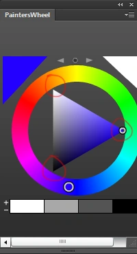
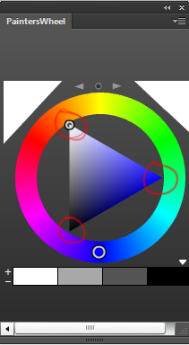
As you can see in the images above, blue and white are way on the edges of the triangle (the color wheel) which means these two colors are at their maximum 'brightness' (you could say), which means you cant make this shade of blue any brighter and you can't make this white any more white. Also note that this blue is 100% blue pigment. If the color of blue changes when you move the cursor to the left or right side of the color wheel, it means that it has been mixed with another color (red or yellow).
We see color in relation to other colors. It is inevitable (and very obvious) for these colors to appear intense when paired together. Therefore, it is not just a subjective opinion to say that these colors are very bright. Personally, I don't think this is ideal for a digital screen.
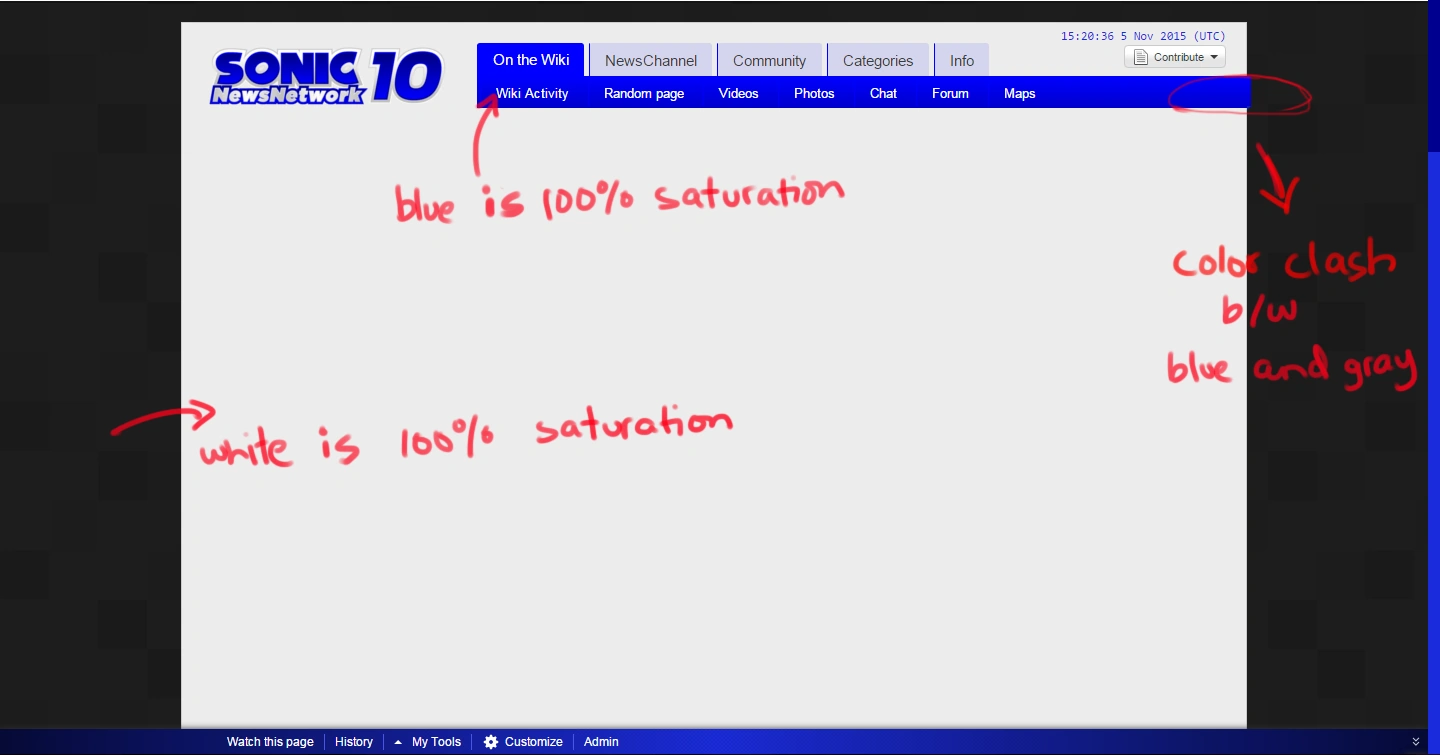
Although gray does help go easy on the eyes, it clashes with blue. I've circled this on the top right. You might have to look closer to notice it. The colors do not work when placed together. It's very uncomfortable.
Overall there is no harmony in this palette.
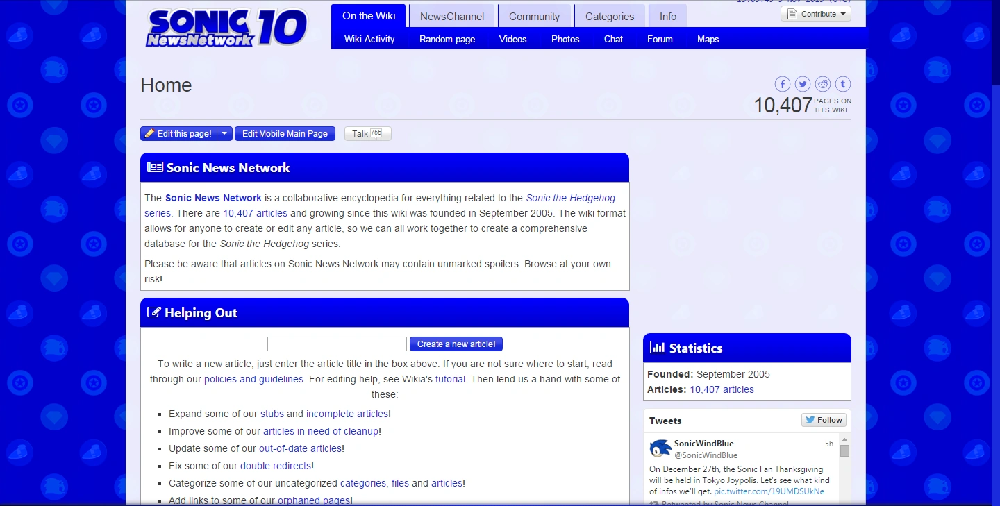
This is a problem for me because I have created a background for the wiki, but it looks downgraded whenever I adjust it to this color palette -
Way too intense but this won't look good in gray either. I have explained that above.
This is the background in its original color. You can also see it in my sandbox - http://slugbox.wikia.com/wiki/Slugbox_Wiki

I am not criticizing the current look because it isn't the most interesting design ever. Just need something, at the very least is decent and doesn't have colors that clash.

