
Arial? Aharoni? Really? We can do better than that, SNN.
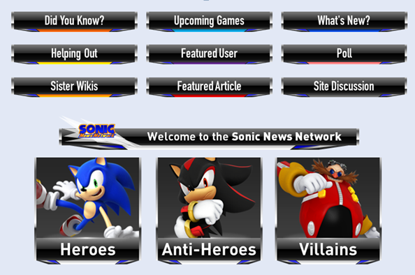
I think it's now time the headers and buttons of the main page needs an upgrade, here's my concept.
Anything that needs to be changed?
Arial? Aharoni? Really? We can do better than that, SNN.
I think it's now time the headers and buttons of the main page needs an upgrade, here's my concept.
Anything that needs to be changed?
Looks pretty good. Nice work. There's not a big issue with the dark gray, but I would like to see this in gold.
maybe out of the smalled headers like "sister wikis" have a character above it or somethign similar.
I think we should update the font here in general. The Pokemon Wiki has article font changes and things like that.
Personally, I think adding a character to the smaller headers will ruin its look.
NO AHARONI? Noooooo
It looks good, but I can't say better. I wouldn't change much however, perhaps the sharp grey color just doesn't seem to go with the current theme IMO, and the character images look too scattered (say, Sonic is striking a pose, Shadow is just standing, which to me, doesn't look good).
(say, Sonic is striking a pose, Shadow is just standing, which to me, doesn't look good).
Oh, those are demos. The final versions will use the current images that we have in place.
SonicTheHedgehogDude wrote:
(say, Sonic is striking a pose, Shadow is just standing, which to me, doesn't look good).
Oh, those are demos. The final versions will use the current images that we have in place.
Oh okay. To conclude, it looks good, some color adjustment would be nice.
These concepts are pretty good, in my opinion. I have no problems with them. TheFallenOneGOTH of the Fallen Kingdom (Talk, Contribs) 10:47, November 16, 2014 (UTC)
